Have a Look at How eWay-CRM Reflects the New Microsoft Office Style

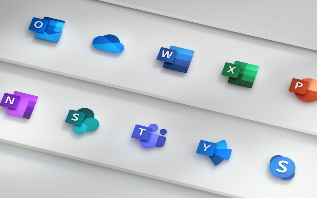
In the first months of this year, Microsoft is launching new graphic icons for the Office 365 program pack. Their design should be bold with light hues, combining “simplistic visuals and instantly recognizable symbols”.
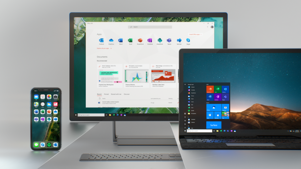
The new set of icons will be used by popular programs like Word, PowerPoint, Excel, Skype or Teams platform introduced in 2017 and other parts of Office 365. New design will be distributed to half a billion of the Office users until summer of 2019. Users of mobile and web version of Office will be first.
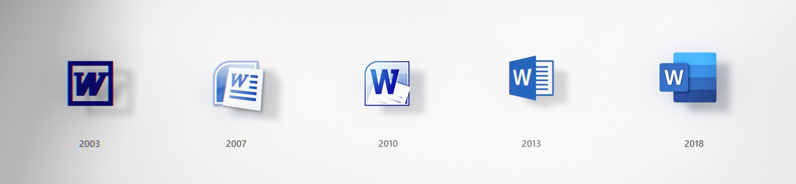
The last Office icons graphic update was launched by Microsoft in 2013. Six years don't seem so long, but back then, the selfie phenomenon was just about to be published in Oxford dictionary and emoticons were quite buzzworthy!
How has Office changed in the last few years?
Through last six years program pack Office has transformed into a co-working and communication platform. Some AI solutions are running on the background, mining data sources, creating documents through voice dictate or enriching articles with knowledge from LinkedIn network.
Many new applications, which are a part of the Office pack, use AI technologies through Teams platform. This trend should be symbolized by new look of icons.
 Source: Microsoft.com
Strong colors and use of Gestalt psychology
Bold colors were always in the core of Office brand and new icons should further widen this palette. The colors made each application different and personalized. Chosen hues should be bolder, lighter and more friendly for users than before.
New design is even using knowledge of Gestalt psychology, through which Microsoft wants to accent the past changes of Office pack. Simplicity and harmony are key visual elements and symbolize connectivity and intuitiveness of Office applications. There is a unique symbol for each icon, but there also exist connections between symbols of applications and the whole Office product line.
 Source: Microsoft.com
Right now five generations are using Office programs on many devices and platforms. That's why designers of new look wanted to create a visual language able to address emotions of all its users and work on all possible systems.
 Source: Microsoft.com
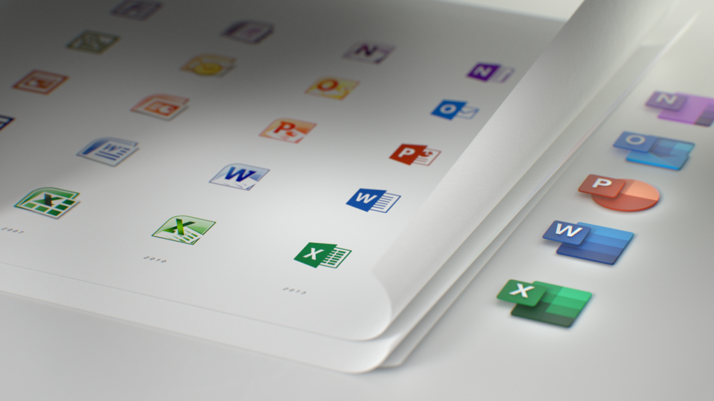
New concept of symbols and letters
Designer’s central idea was to “decouple letters and symbols in icons” and essentially create two panels, one for letter and other for symbol, which could be later paired or separated. This way, users are still familiar with the icons, which emphasize the simplicity of used applications. Divided panels add depth to graphic layout and they are ideal to use in 3D space.
New icons should symbolize connectivity of each Office application, allowing users to open Power Point presentation or tabs in Excel while communicating with colleagues in Teams or writing email through Outlook. Therefore designers removed visual boundaries of traditional tools formatting. Part of previous Office icons were outlines of Word document or Excel tab. Current design is using text links for Word and individual cells for Excel. Focusing on content more than on specific format is supposed to symbolize collaborative possibilities of Office applications.
The change of letter to symbol ratio should bring the same effect. In the previous look, a letter took up two thirds of an icon and a symbol the rest. Bigger symbol is emphasizing its influence on creativity, because the letter itself is just a tool. New graphic look of icon is a result of repeated tests and in depth research and according to its designers, it is just a first step on a long road.
How will be eWay-CRM changed?
Thanks to integration with Outlook, our eWay-CRM is quite well acquainted with Microsoft Office environment. Because of that we must quickly react on any graphic changes made by Microsoft. We are happy to announce that eWay-CRM will present new layout of icons matching the fresh look of Office 365.
"We try to customize our program to every change of Office pack, so our clients can enjoy the easiest possible way how to orientate in Microsoft environment," says developer Jan Spilka.
 Jan Spilka
New designed set of icons will be released as a part of next planned update, namely in version 5.5. Last update labeled 5.4 was issued at the end of April.